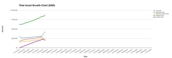
Remember I mentioned in one of my blog posts recently that I cleaned up the tabs and spreadsheets of our Google Sheet assets, liabilities, income and expenses tracker? Yup, we now only have 1 graph that charts the growth of our total assets and net worth. We used to have a number of graphs tracking the components separately but decided to combine them into one for easier reference. Look at how neat it is!
I considered including this Total Asset Growth Chart in the Net Worth Page but decided against it. After all, it’s going to slow down the updating of the numbers on this blog, which is something I do every month and would like to save time on. But I have to say, the graph is a powerful representation of the progress we have made since 31 Dec 2015.
I’m guessing I have to explain the time duration ......