A belated lunar new year to my readers.
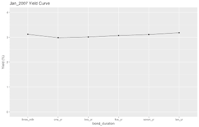
With the submission of my last assignment for the semester, it is time to blog again. In my previous post, I described where and how do you get the data to plot the yield curve. In this post, I will be spamming everyone with line graphs of the Singapore Government Bond Yield Curve from January 2007 to December 2009. The underlying rationale is to eyeball the data to verify whether was a yield curve inversion present before/during the Global Financial Crisis (GFC) and how well do changes in the yield curve over time provide us with ample warning of a stock market crash. The answer? Not as clear-cut as I expected. First things first. Some definitions and assumptions before we begin. 1). I downloaded the SGS data by month. If I recall correctly, it refers to the yield at the last trading day...