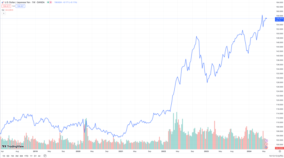
The chart below shows 4 different US indexes, the yellow S&P 500, which represents the large-cap stocks, the purple is IJH or iShares Core S&P Mid-Cap ETF, the cyan RSP or Invesco S&P 500 Equal Weighted ETF, and the orange IJR or iShares Core S&P Small-Cap ETF:
Click to see a larger chart
This would allow us to see the performance of the various segments of the US market.
We observe that all 4 were in a tight range, but in recent months, three out of four indexes struggled to go higher. This is similar to other indexes around the world.
Only the S&P 500 was able to power ahead.
The more interesting comparison is the yellow versus the cyan because that measures the cap weighted S&P 500 against the equal weight. The outperformance is likely due to the more heavy focus on Information Technology with the AI theme doing well....