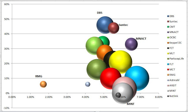
I created my very first portfolio Bubble Chart! :)
*X-axis: Yield-on-price
*Y-axis: Unrealised paper gain
*Size of bubble is based on market value of the counter
*Propnex is excluded as it has not given a full-year dividend yet Overall patterns:
- All counters have above 4% yield-on-price except RMG
- All counters are in the green except NetLink Trust (as of 14 Dec)
- Most counters are concentrated in the middle-right part of the chart Outliers: ...