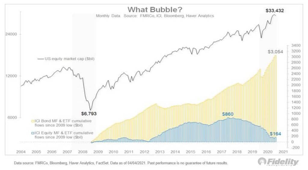
The chart below shows that equity funds & ETFs have barely taken in fresh investments since the March 2009 bottom, despite a 660% return for the S&P 500. Incredible. Bond funds & ETFs, meanwhile, have taken in more than $3 trillion. Begs the question: Where’s the bubble? pic.twitter.com/v7IMAAYAt7
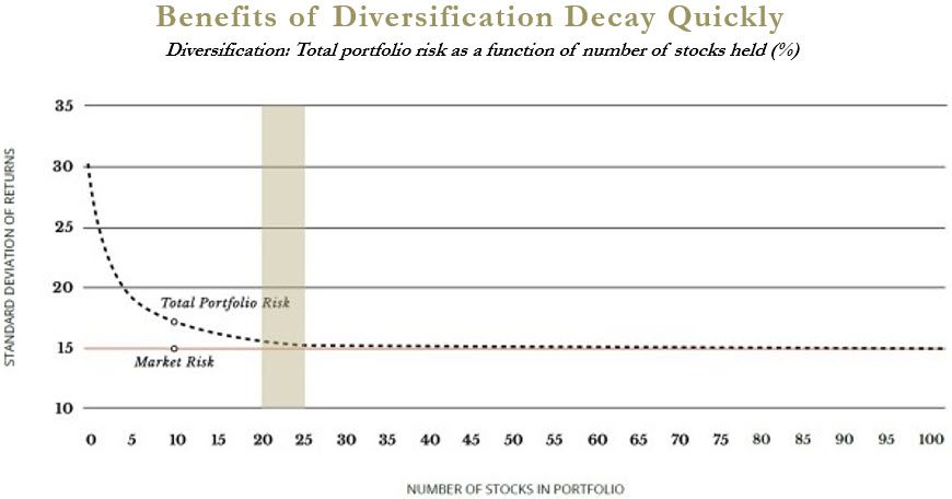
— Jurrien Timmer (@TimmerFidelity)...Every week, let me kick-off by highlighting some of the more interesting data points on the markets. Looking through some of these data might give us an idea how euphoric and overbought the market is, extreme fear and low participation, or just choppy. These are not buy signals or sell signals but it may give you an appreciation about the trend of the markets. Fresh Money Flows More to Bonds than Equity! The data that caught my attention this week was this fund flow chart put out by Jurrien Timmer, the director of Global Macro at Fidelity.