


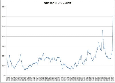
I was trying to search for the historical price to earnings ratio or in short, the P/E ratio for the S&P 500, a major US index. My search was not exactly that fruitless and I managed to get a Excel spreadsheet of the data from the official website of Standard and Poors here although the data is only up to 2008. However, the data goes back to a long time starting from 1936. Using the data, I managed to plot the P/E ratio against time and the chart is shown below.
From the chart, the P/E ratio has not drop below 10 since 1984. Following which, the P/E ratio has consistently remained above 10. This chart is a good gauge of when it is a good time to accumulate the S&P 500 given that one can buy an ETF that tracks the S&P 500 on the SGX. This ETF is the...


