I saw this deck of JP Morgan guide to the markets on Twitter a few days ago and decide to have a cup of coffee and go through it.
JPM periodically do this set of slides and it is always informative.
They cover the current valuation of the equity, bond markets, some investment stuff that is related to financial planning, factor investing, climate change and some interesting data that is less traditional.
In today’s post, I tried to pick out some of them to bring to your attention and give you some of my perspectives.
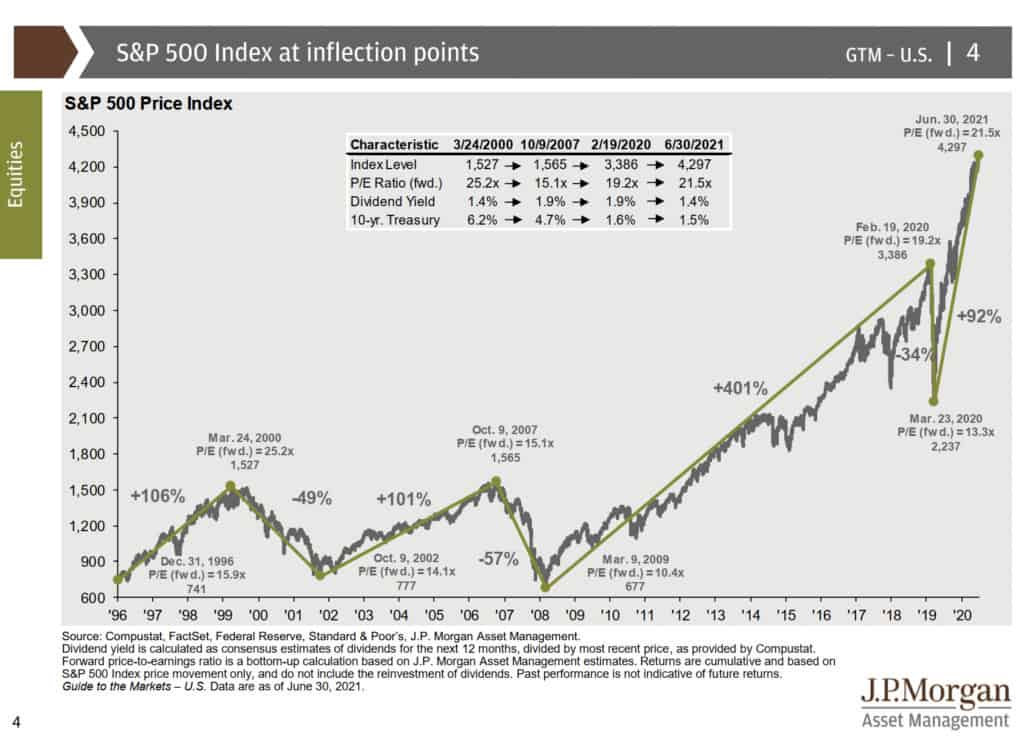
Prices looked to be at Extreme Levels
The tail end of this chart just show you how compressed this recovery was. JPM layered some valuation metrics together with this chart.
Forward price earnings looked to be on the high side but never as extreme as the 10-year treasury bond....