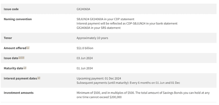
Renamed to Historical Charts
Removed detailed table
Data changed daily closing price basis
Added charts of dividend yield, P/NAV and closing prices for 1-year & 3-year periods
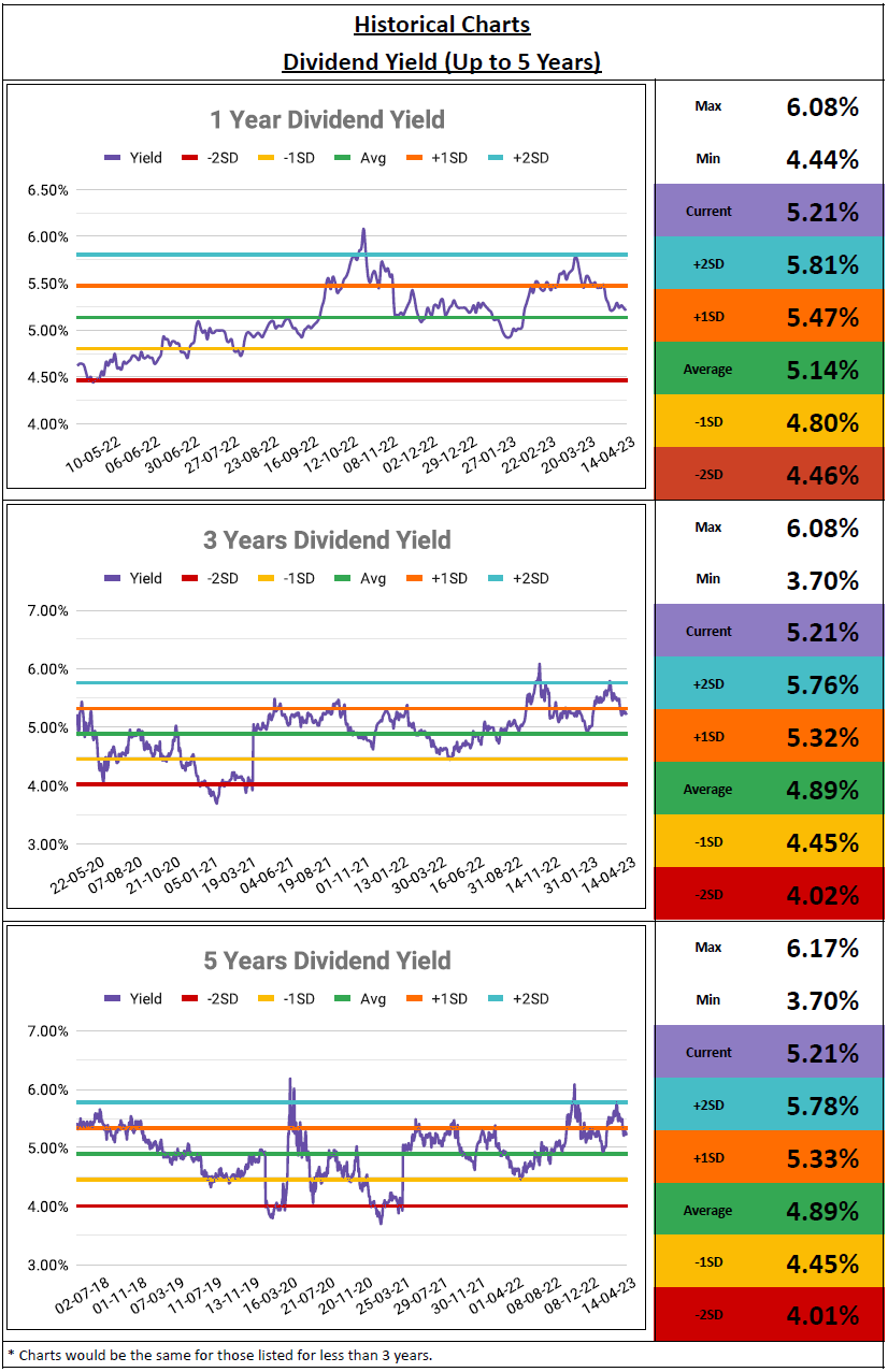
Previously on 26 Nov 2020 (link), I revamped the price relative chart section to display trendlines for +2SD, +1SD, average, -1SD, and -2SD on the 5-year chart of dividend yield and P/NAV. The information is based on the weekly closing price to reduce the loading speed. Subsequently, on 1 Jun 2021 (link), I removed the trendlines and replaced them with a table that shows +2SD, +1SD, average, -1SD, and -2SD for 1-year, 3-year, and 5-year periods. Why a table instead of charts? The reason is the same, also to improve loading speed.
The good news is that embedded Google Sheets now load faster than they did in 2021. Additionally, I have discovered a new way to generate trendlines, thanks to ChatGPT. Both have made possible for this update, let's see what it looks like below:
Price Relative Charts